
Maps and radiation patterns

 Brian Butterworth published on UK Free TV
 I have been working on the site upgrades over the weekend and I have few images I hope might find interesting.
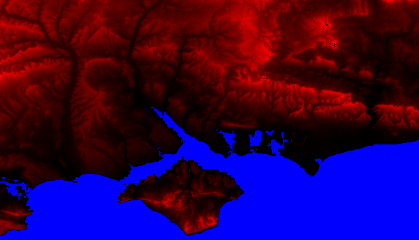
First, the UK terrain database used for calculations now has a lot more resolution, as demonstrated here with the dataset around the Solent.
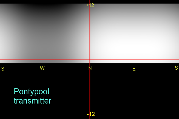
Secondly, here is an example diagram showing the 3D radiation pattern of the Pontypool transmitter. The horizontal red line is level, with the top being 12 degrees up and the opposite down. North is shown in the centre going east and west to south.
The lighter the colour in the diagram the stronger the signal.
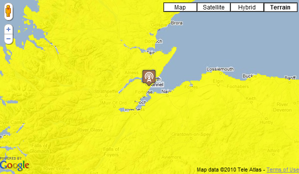
Thirdly, the Google mapping accuracy for the transmitter overlays has been improved, as you can see in this example image:
Coming soon!
All questions
In this section