Upgraded viewing figures graph format
 Brian Butterworth published on UK Free TV
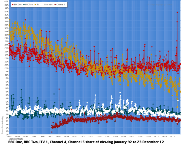
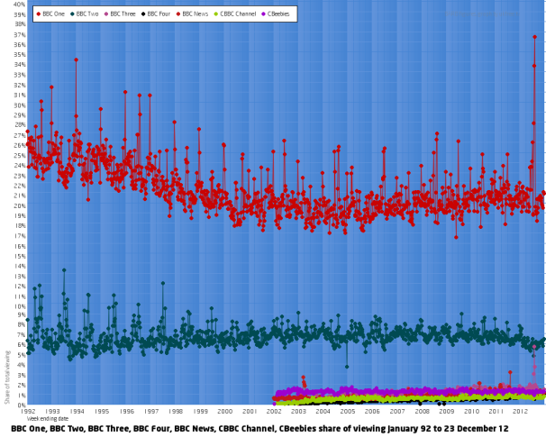
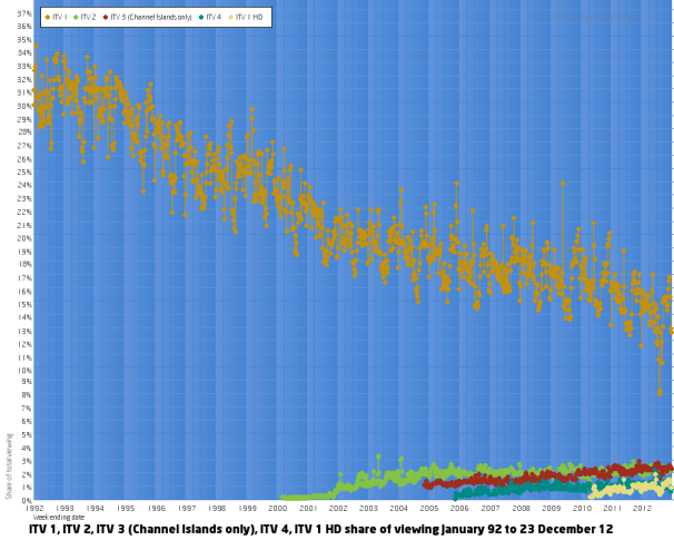
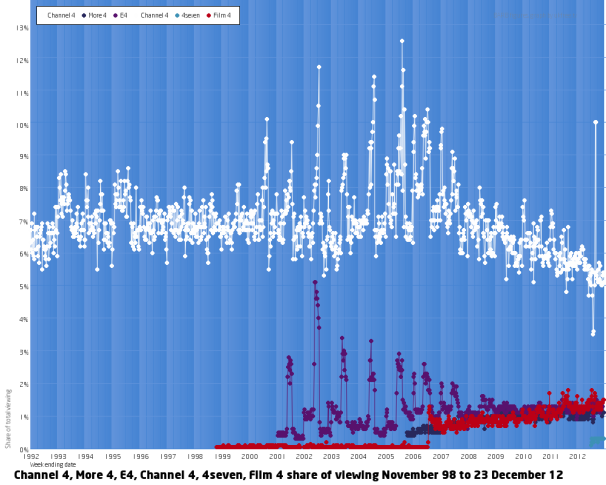
 These graphs now show on many more channel information pages.
The colour of the graphs now automatically matches the colour of the logo for the channel.
Here are some sample graphs:
The so-called "terrestrial channels", going back to 1992.
The BBC channels:
The channels provided by ITV:
The Channel 4 group of channels:
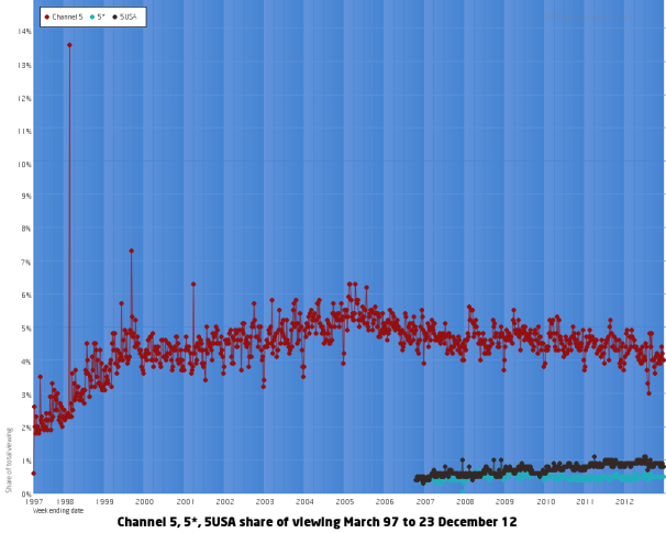
 And the TV channels from Channel 5:
Help with Freeview, aerials?
Thursday, 3 January 2013
On the top graph (Terrestrial channels) you also have a white line from 2011 for Channel 4.
Is there no data for Channel 4 before 2011?
Surprised how big the Channel 5 figures are in the 90's due to the very very slow interdiction of this channel.
They only managed to finally transmit to the who country at the end of 2012.
| link to this comment |
Saturday, 5 January 2013
Mark Agius: Before 2011, Channel 4 and S4C "shared" data. I fixed this later, but I uploaded the wrong graph... the link has the right one https://ukfree.tv/barb….png
Channel 5 got to around 70% of the population at launch, and long before multi-channel was widespread, so it had quite an easy ride in some homes.
Channel 5 was on analogue satellite from the off too, and was on both DTT and Sky Digital at launch, and reached many places that ONdigital/ITV digial with high power analogue services.
Remember that Channel 5 was always part of the "four and a half" analogue plan, whereas the pre-DSO digital services weren't.
| link to this comment |
Monday, 7 January 2013
M
M. Partington2:17 PM
I am surprised at the viewing graphs . My own preferences must be very different from many; I watch BBC1 much less frequently than other channels such as STV and C4. I probably watch Pick TV more than BBC1. I seldom, if ever watch BBC3 & 4 . Of all the BBC channels, I watch BBC2 the most.
| link to this comment |