
2050 Tube Map
Euston Kings Cross St Pancras station with Crossrail 1, 2 and High Speed 2. Photograph: Brian Butterworth

Download the WHOLE London 2050 - a Tube Map for the future as a PDF or click on this image to see it as an SVG (most modern web browsers support this).
![]()
Everything here is based 100% on the detailed reading of the London Infrastructure Plan 2050: Transport Supporting Paper (London Infrastructure Plan 2050 | Greater London Authority) and the amazing help I had from London Reconnections - Covering transport topics in and around London on their London 2050 (Part 1): The Trillion Pound Time Warp.
Things to look at
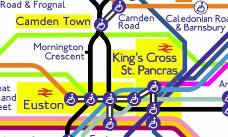
It was 100% essential to ensure that the Tube Map remained faithful to the one we use today, the one based on the designs of Harry Beck.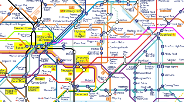
So, you will find that all the lines are horizontal, vertical or at 45 degrees.
All the station symbols (blue wheelchair, white wheelchair, coloured ticks and interchanges) are 100% standard.
One invocation that I did allow myself (spurred on by a comment from Diamond Geezer) was that the high-usage "destination" and "gateway" stations have larger font text and yellow highlight to help you locate these stations quickly.
Another slight innovation is that stations outside the "legal" Greater London area are shown with light colour text, and the M25 motorway is also shown where lines cross it.
As you can see from the above example, the following lines are shown that are not on the current map:
Crossrail 1: royal purple line. I am especially proud of the strong vertical in the top right hand side from Whitechapel to Stratford and on. This is going to be a fast line, so it has priority. On the right hand side the line is a strong horizontal and other stations have moved to accommodate the fast line.
Crossrail 2: line green line. This shows the current consultation route. I'm very proud of the way the line connects though the central area whilst remaining clear. This was quite a tough one to solve.
High speed 2: bright green line. Good use of direct lines for this express line.
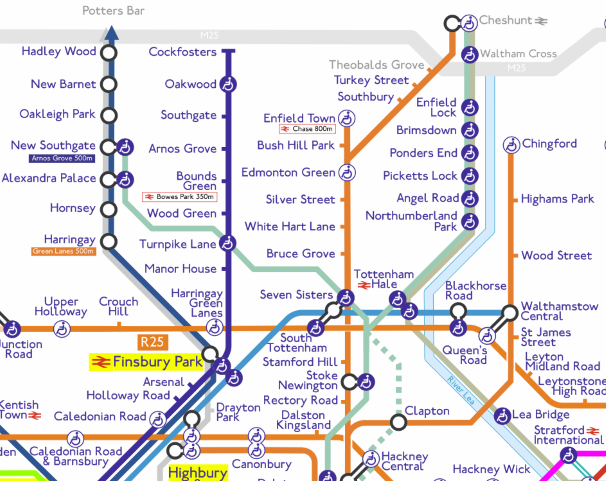
Overground: 2015 new lines in the Lea Valley, the above example showing the Chingford, Enfield Town and Chesunt lines (as well as Crossrail 2) with new interchanges.
The above diagram also shows the STAR line with Lea Bridge.
The Overground line from Upminster to Romford can also be seen on the whole map.
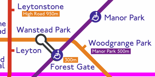
A useful little feature is out-of-station interchanges are shown with the walking distance.
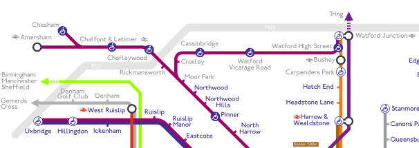
This section shows the use of "off page" markers to show connections outside the London area, such as HS2 to Birmingham, Manchester, Sheffield, Crossrail 1 to Tring. Also shown here is the new Watford arrangements for the Metropolitan line.
In the lower right section you can see the proposed additions to the Bakerloo line.
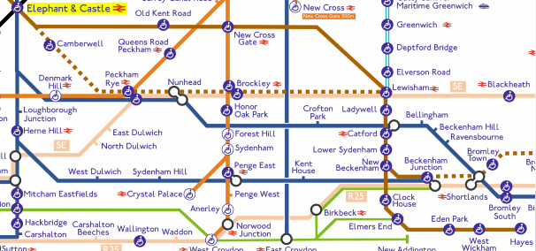
You can see from the detail that the map also shows the new Thameslink arrangments, as well as the proposed changes to the Overground to create an outer orbital route called on the map the "R25".
Anyway, I really hope you enjoy the hard work that has been put into this.
Brian
Extra! Extra!
The map featured on BBC London News on Wednesday!
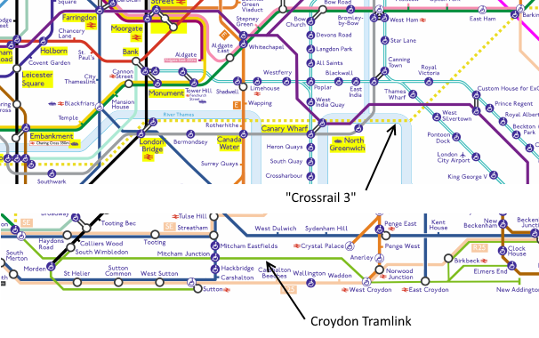
And now there is Crossrail 3 and Croydon Tramlink
Sunday, 14 September 2014
Iain Martin: Thanks for the link. There's more London 2050: A Cartographical Interlude too.
I've updated my maps here too. Now you have:
Croydon Tramlink
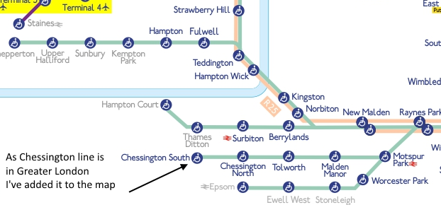
CR1 goes from Heathrow T5 and Saines only. The dotted line to Surbiton to show that the southern connection is to link to other lines in the area was universally misunderstood.
Hampton Court is now under Hampton and that CR2 changed to occupy the vacated space;
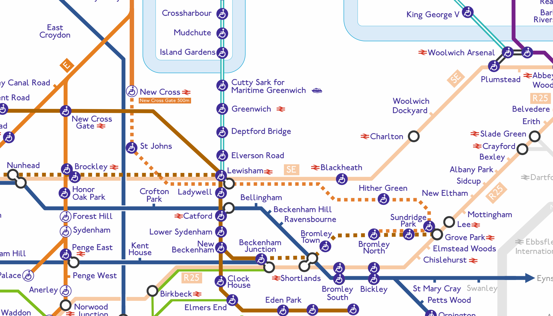
Due to evidence from Bromley Council, the expensive but correct interpretation of the Bakerloo line going Shortlands->Bromley Town->Bromley North->Sunridge Park->Grove Park is a dotted line.
Acton Main line, which was going to "move to Old Oak Common" has been put back. There is an old diagram that shows both...
On this version there have been a fair few additions of "blue wheelchair guy" symbols thanks to @Anonymous Wheelchair User
Also, I have copied in the "indicative Crossrail 3" route from the "Airport Express" on this diagram as it the firmest thing to go on.
CR3 is shown as a dotted yellow line (as it never crosses the circle line) and I have change CR2 to pale blue to not clash with the Croydon Tram green.
CR3 is shown as Twickenham->Richmond->all stops to->Clapham Junction then Waterloo, London Bridge, Canary Wharf->Barking-> Dagenham Dock->Rainham with a second link from Wimbledon to Clapham Junction via Earlsfield.
Also from this diagram I have added HS1 at Barking.
The trams have a little more "space" and the Sutton to Mordon link doesn't call at the intermediate stations.
I have also show the CR2 "Hackney" route as a dotted line, as lots of people have asked about it.
Enjoy!
| link to this comment |

Also, bonus materialm here is a Bromley Council plan for the Overground:
| link to this comment |
Tuesday, 16 September 2014
A
Andrew11:33 AM
By 2050 large sections of LU will have closed, starved of funding as London will be a separate country from the rest of England, having been voted out in a referendum. What would have been the TfL budget will have provided Leeds, Birmingham, Bristol and Cardiff with new rapid transit systems.
| link to this comment |

Wednesday, 17 September 2014
Can I just say that I'm sorry to everyone who uses Barnehurst, Barnes Bridge, Battersea Park, Bexleyheath, Bowes Park, Caterham, Cheam, Chelsfield, Chelsfield, Chipstead, Chiswick, Coulsdon South, Crews Hill, Dagenham Dock, Deptford, Eltham, Enfield Chase, Ewell East, Falconwood, Feltham, Gipsy Hill, Gordon Hill, Grange Park, Hither Green, Hither Green, Kenley, Kew Bridge, Kidbrooke, Kingswood, Knockholt, Knockholt, Maze Hill, Norbury, Palmers Green, Purley, Purley Oaks, Queenstown Road Battersea, Rainham, Reedham, Riddlesdown, Sanderstead, Selhurst, Smitham, St Johns, Streatham Common, Streatham Hill, Tadworth, Tattenham Corner, Thornton Heath, Upper Warlingham, Welling, West Norwood, Westcombe Park, Whitton, Whyteleafe, Whyteleafe South, Winchmore Hill and Woodmansterne stations in that they are not run by TfL and so don't appear on the Tube Map.
| link to this comment |
Final map thoughts
On my way back from the gym this morning I had some final thoughts, so I thought I would share these with you. These are more in the way of a brain-dump, rather than a sophisticated final treatises.
I guess the first thought is that I might not have actually done through the process if I had known what was involved. Yes, it was lovely to see the map on the BBC News last week and to have thousands of people "like" it on Facebook, but you are certainly setting yourself up for a lot of brainwork. When some people said I was "mad", I think I know what they were getting at.
The work aside, I have very much enjoyed having access to the specialist knowledge on the wonderful London Reconnections site. I am very proud that they supported my work and I really hope it makes the site more popular.
There have been a number of people who wished that I had started with a different map, or a totally different map altogether. Some people have expressed their like for geographically "correct" maps - even though there are huge issues here due to all maps being flat "projections" of a section of a globe - and others see a conspiracy against where they live due to the historical development of our capital city.
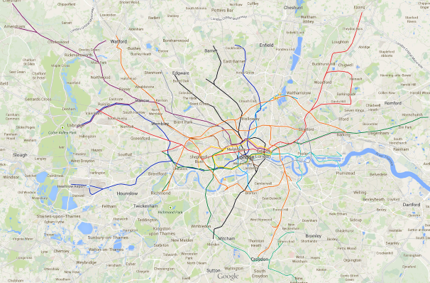
Google's map of the lines geographically "correct"
It is often said that Harry Beck got his inspiration for his map from electronic circuit design, but it seems likely to me that he would have known about the Seven Bridges of Konigsberg and the work of Leonhard Euler (1707-83). Beck insight was that the general public would understand the diagram he produced. It is to the great credit to those working at the London Underground to realise that they have a work of genius on their hands.
Try as they might, as many have, no-one has come up with anything better. Yes, they have tinkered and tried things out, but in a world of free ideas and easy computer aided design, the "keep it simple stupid" (KISS) of Beck's design still wins.
My changes are but tinkering, as is right. Bigger font for the most used "gateway and destination" station seems to have gone down well. The river Lea, much liked. The M25, no one has demanded the removal. Light Orange for the R25, bright pink for HS1, seems OK. I use some "off page markers" of arrows and dots. Grey text for outside Greater London, works OK. Selected interstation walking distances, much liked. Stealing the Waterloo and City's colours for HS2 and recoloring W&C. Thin green line for the trams. Dotted yellow for CR3.
It's actually quite odd to stand and compare this map now with the original. I was doing that yesterday at Startford DLR as I waiting for my 100% reliable transport (it says on the posters).
When I started, the Crossrail lines "weaved and bobbed" around the map. I have moved most of the elements on the map to provide these high-speed, high-capacity lines as straight lines. Harold Wood to Whitechapel is a single diagonal line, West Drayton to Paddington a straight horizontal, and the CR1 line crosses the centre with the minimum of fuss. CR2 is a little less straight that I would have wanted but I didn't want to change the familiar "inside the circle line" centre of the map at all.
I did change the King's Cross to Finsbury Park corridor into a single, strong diagonal, and the map is clearer for it. The only thing that I'm not happy about is I really wanted Manor House to be below the Overground.
There are so many changes from the original, some are subtle (the City Branch of the Northern Line is slightly shifted, Beckton has moved up a little) and some large (Barking has moved to stretch out the Hammersmith and City Line so Barking Riverside isn't too far away, the Central Line's Hainault loop is a lot different).
People are correct to point out that a "tube map" would probably not have Thameslink or the Northern City Line but they were necessary to understand the report properly and the do add to the understanding.
This map needed the combination of several skills. I have been using CorelDraw X6 (16), a software package I have used since version 2! Such familiarly with software makes it possible to do things as you conceive them, which is useful.
I suspect that my long-lost qualification in "Engineering Drawing" might have been helpful, as well as an A-Level Physics that encompassed electronics.
Another skill is that of graphic design. There is a lot to understand in the design, the elements, how they combine and the constraints. The font is "London Tube" a copyright-free version of the official one. The colours are as specified publically (as "Pantone colours") by LRT. I stuck to a limited set of symbols: the "station tick", the "national rail symbol", the "line end" symbol, "blue wheelchair guy" and "white wheelchair guy", two types of "station interchange" the long one and a short one.
The lines are all either horizontal, vertical or 45 degrees. I kept the curves where they were on the original map and also the line bend style. All the lines are the same width. I did my best to always keep station names on a single line, but where this was not possible they all have the same line spacing.
Another skill needed was that of research. Aside from starting with the existing 2014 Tube Map, and the much mentioned (by me) LONDON INFRASTRUCTURE PLAN 2050: TRANSPORT SUPPORTING PAPER, I have had to cross reference the information in this with other documents.
Such publications cover topics from the redevelopment of Brent Cross, the upgrade of the Croydon Tram system, research by Bromley Council, plans for HS2, reports into Barking Riverside, Old Kent Road redevelopment, the Lea Valley Development plans, the STAR (Stratford to Angel Road) proposals, the detailed Crossrail 2 2013 documents (for the proposal of South Tottenham being linked), 2014 CR2 documents (for the Stoke Newington and Clapton stations), DfT documents decising which London railways get transferred to TfL (Chingford line yes, Enfield Town line, yes, Tottenham Hale Lea Valley line, no, Upminster to Romford "shunt" yes, everything else, no).
I'm so very grateful to carto.metro.free.fr Detailled London transport map (track, depot, ...) for the detailed track plans, and of course to Google Maps. Also abandonedstations.org.uk and disused-stations.org.uk for being inspritational - see the Interactive map of closed and proposed London Underground, Overground stations of them.
I've also had to read up on a lot of policy issues I was only half aware of, in particular what constitutes "step free access" and why it is important.
The last thing I should mention is that the map has inspired me to take a few train trips to places I haven't been before, such as Bromley and Epping. I went to Bethnal Green to walk from Line to Line. And I can say that I have visited every DLR station now. Who know, I might nip down to Croydon for a quick tram ride?
So, to conclude.
I have spent many years reading books about the underground history. "Rails Through the Clay: A History of London's Tube Railways" (Jackson and Croome, 1993) and "London Under London: A Subterranean Guide" (Trench and Hillman 1993) being two of the best.
And I had one of those "poster books" of the underground map showing closed stations (and an apology for the cover being "defaced by a barcode").
It shows the complexity of the subject that even after all this time there are still stations you missed, viaducts you passed under or over but didn't take in.
There was a couple of guys on the DLR train I was on yesterday saying that "they didn't come this way much" and "it seems to have change a bit". Well, yes!
As I said before I recall being at North Woolwich station in the late 1980s seeing the signs for the North London Line and seeing this sign and thinking how sad it was that this marvellous service ran hourly.
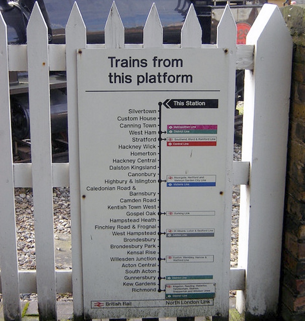
Today, the service is regular. Richmond to Stratford is the popular Overground, the rest of the line has Jubilee Line trains every few minutes. And the DLR is there too.
So, yes, the Mayor's vision might be imperfect. But it's a vision and if this old sign proves anything is that when people can see something of the future, they want it.
So, please, one last time, take a look at the map I did ofthe Mayor's 2050 vision and hope that as before you get more than you could have ever hoped for
| link to this comment |
M
MikeB7:57 PM
Briantist: An amazing map, and one which shows just how complex and large London's transport links are (and will be). You've done a fantastic job in showing what might be, if money etc allow it.
One thing did strike me. While not a 'train buff', I do find the Tube facinating, not least in the way it has shaped London, and the often arbitary way in which the system has developed (I have a background in archaeology, so its nice to to see some of the forces in action when cities grow). I've recently read Christian Wolmar's 'The Subterranean Railway', and in it, he paints a picture of the 19th century railway companies restlessly expanding throughout London and beyond, no matter what the economics of the plans might mean.
If you look at the Northern parts of the map, you'll see Sir Edward Watkin's vision of the Metropolitan Railway made flesh - expansion well beyond London and connections to the rest of the rail system. I seem to remember that Crossrail is taking the much earlier idea of a 'through' railway , which had been mooted even before the 1940's proposals, and there might have even been plans for the outer 'orbitable' railways. It looks that by 2050, plans thought up c.1890 might have actually become reality!
London Under London is an excellent book, and although there is lots more information on the market now, it would be nice to have a (very much) updated version.
I remember the North London Line in the late 1980's - I caught a train one weekday afternoon which closely resembled a bus on tracks, complete with a conducter armed with a bus style ticket machine! It was a bit like something out of John Betjeman's 'London's historic railway stations' or 'The London Nobody Knows'.
Any chance of a map showing 19th century plans overlaid with 21st century ones? I'll understand if you want a rest for a while...
| link to this comment |
Thursday, 18 September 2014
Tuesday, 6 January 2015
D
Duncan Hill6:15 PM
Is Theobalds Grove station going to move to the other side of the M25, or will the M25 move?
| link to this comment |
Friday, 29 January 2016
So now the southern-running suburban franchises are to be brought under TfL control (and let's face it, if it happens there it will happen in the north too) - fancy re-redrawing the map to include those stations? **gauntlet thrown* :P
| link to this comment |
Monday, 1 February 2016
J
Joshua1:01 AM
Interesting and clearly effort has gone into this. Rainham Station isn't outside Greater London though so should be included and not blacked out. Maybe you were thinking of the one in Kent? I also think the yellow highlights for main stations make it harder to interpret the map, and they will probably have to start using dotted lines for Thamselink etc as the colours are too similar (eg to the Piccadilly Line).
| link to this comment |
Select more comments
Your comment please!