Seeing something different? We are doing A/B testing on a new Material Design

Mobile first
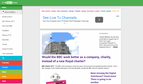
I have created a new "mobile first" design for UK Free TV. To do this I have used the Material Design concepts - outlined here - which anyone who Android "Lollipop" or Google Inbox will recognise.
A/B Testing
To allow for the changes to be tested against the existing site, A/B testing is being used. This means that 50% of users will get the new design and 50% the old one.
Where is the menu?
Use the "hamburger" icon at the top-left right of the page to show the menu. It will "pop out" from the left-hand side of the page.

Where are all the updates?
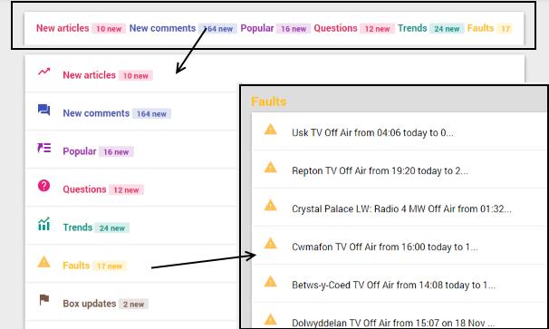
All the "live updates" that were located in the right hand column of the old design are now a new system that starts as the top "sheet" on each page. You click on the combined bar and it expands to show all the updates. You can click on a coloured section to show all the items for that section.

If you wish to close back to the single line, click in the dark grey "border".
Problems?
If you spot any problems, please let me know below.
9:14 AM
No issues with the new design, all I would suggest is that all items posted have the date of posting included, without this there's no indication of how recent the item is.
| link to this comment |
9:47 AM
Brianist: If I view the comments page on Safari on my Ipod, the section any new comment is in is fine on the left hand side of the screen. However, the comment itself, in the right, is much harder to read, because it is a large (narrow) block of text, with the section heading half way down. The blocks of text all run together, making it very difficult to seperate one comment from another.
Its a bit easier using landscape, but frankly, the old (desktop) system was easier to read.
| link to this comment |
MikeB: If the comments are in more than one column, you are on the old design.
Click https://ukfree.tv/extr…rial to see the new style...
| link to this comment |
Vaughan: The date is there: the comments are grouped by date and it is just above the box. It says "Tuesday, 25 November 2014" just above your name, for example.
| link to this comment |
10:35 AM
Briantist:
I have issues with the design as it's being offered to non 'smartphone' users and looks to lack much of the content we normally expect (I use a Windows 7 Pro laptop). Your method of determining what device is being used may fall foul of the fact that Android is not only used for some smartphones but for tablets, pads, etc. They would normally be able to show the 'traditional' layout perfectly well because of the reasonable screen size whereas a small screen of a 'smartphone' needs some more appropriate layout. And do bear in mind that not everyone has the very latest versions of the smartphone or OS.
Worth the experiment, but needs more work I suspect.
| link to this comment |
MikeP: I think you've managed to pick up a possible misconception there.
The principle of "responsive" design is that you deliver exactly the same content to all devices, and then the device uses the "media selectors" in the CSS code to change the way the site looks for that device.
So, there is 100% of the existing content showing now (search box aside) it just it gets resized.
The complex bit for existing sites it taking everything that has been designed on a fixed grid (it was 606 pixels before) and making it use CSS classes to make it work with the CSS "device-width" system.
It seems, from the statistics, that people are getting the hang of it.
| link to this comment |
3:44 PM
Brian,
Under the new system where is the option to find your local transmitter by postcode which used to be on the top right of the screen previously? I can't find it anymore.
Is it in the Extras settings? Again I can't see this if I hit the icon at the top right of the screen. I just see a blank page with the url: https://ukfree.tv/extr…ngs. I've tried Firefox, GoogleChrome and Opera (all latest releases) and they all give me a blank screen.
This new look is too chunky for my aliking but then I'm using a desktop and laptop with Windows 7 and no mobile device. I'd prefer the old look personally.
Cheers...Colin
| link to this comment |
6:31 PM
When I go into the website, I'm now getting the 'mobile' version. By pressing the 'settings' link on the top right of the pge, I should be able to change the view to the 'traditional' look (which is vastly easier to use on a laptop). But nothing happens - all I get is a blank screen. Basically, exactly the same as Colin1951. This in on both Firefox and IE. . The mobole version isn't bad for mobile safari, although not perfect, but its a real pain on a normal desktop/laptop.
| link to this comment |
colin1951uk: Click the menu (the "hamburger symbol" at the top right, or the logo) and then pick Freeview and then "My Freeview").
/extras/settings isn't working yet. It have redirected it to the prediction page for the moment.
| link to this comment |
11:07 PM
Briantist
No misconception on my part - I don't like the look of what is being shown as it is unsuitable for a laptop/desktop. It may be fine on a smartphone but not otherwise. The 'selkection' method is clearly not working as I again have the 'smartphone version showing which I find both unappealing and restricted on my Windows 7 Pro laptop as well as my Ubuntu desktop.
I suspect the coding needs a further look.
| link to this comment |
