
Seeing something different? We are doing A/B testing on a new Material Design

Mobile first
I have created a new "mobile first" design for UK Free TV. To do this I have used the Material Design concepts - outlined here - which anyone who Android "Lollipop" or Google Inbox will recognise.
A/B Testing
To allow for the changes to be tested against the existing site, A/B testing is being used. This means that 50% of users will get the new design and 50% the old one.
Where is the menu?
Use the "hamburger" icon at the top-left right of the page to show the menu. It will "pop out" from the left-hand side of the page.
Where are all the updates?
All the "live updates" that were located in the right hand column of the old design are now a new system that starts as the top "sheet" on each page. You click on the combined bar and it expands to show all the updates. You can click on a coloured section to show all the items for that section.
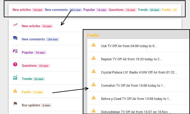
If you wish to close back to the single line, click in the dark grey "border".
Problems?
If you spot any problems, please let me know below.
11:07 PM
Briantist
No misconception on my part - I don't like the look of what is being shown as it is unsuitable for a laptop/desktop. It may be fine on a smartphone but not otherwise. The 'selkection' method is clearly not working as I again have the 'smartphone version showing which I find both unappealing and restricted on my Windows 7 Pro laptop as well as my Ubuntu desktop.
I suspect the coding needs a further look.
| link to this comment |

MikeP: please call you explain what the problems is?
In what way is it unsuitable? It has been tested in IE, FF, Opera and Safari under Windows 7, 8.1 and 10.
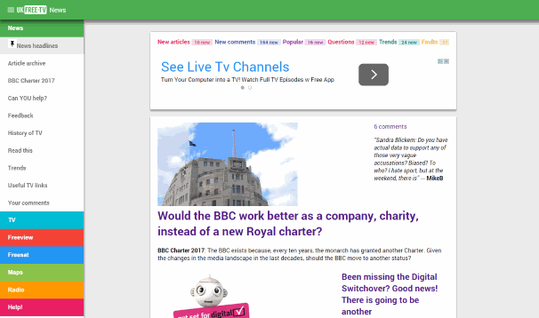
Does it not look like the screen grab at the top of the page (when you press the hamburger for the menu)?
There is no multiple column mode anymore.
| link to this comment |

11:28 PM
Briantist:
It does not look as you suggest! The look of the pages and navigation are the main problems.
In FF 33.1 and IE 11 under W7Pro it is severely lacking in the content we are accustomed to. It lacks the 'tables' on the right side and trying to find the latest comments is a bit of a nightmare as the back button returns to a top level screen and not the previous one! So as I like to view a range of posts, I have to go throught four steps instead of one!
In FF under Ubuntu, the same problem is present and the pages are not good to look at. It may suit a smartphone but not a laptop or desktop at all.
Please can we have the 'old' look and feel back please? Then people can find where to put their post code in for example, see some posts especially from MikeB for more.
| link to this comment |
3:29 PM
Brian,
Thanks for the info on how to find the postcode section again.
After playing around with the Menu it seems to me that you've copied the Windows 8 menu in many ways and I think most people who use desktops/laptops have found the W8 way of doing things very awkward unless some sort of start menu is added to the setup. W8 maybe fine for mobiles but is poor for conventional machines.
You said that the Extras/Settings section isn't ready yet to go live (and incidentally now when I hit that Hamburger button I get the Postcode page and not a blank page as before) so would it be possible to have an option in Settings where the user can switch from what I'm calling the W8 look to the more conventional old look that we had in the past and that way mobile and laptop etc users will get the most benefit from the site.
As things are I find navigating the site to be much more complicated than it was before (as MikeB seem to find as well) so something to help out the desktop/laptop users would be most welcomed.
Cheers...Colin
| link to this comment |
2:06 PM
Not much liking this at the moment, but I am old- though I do have a smartphone and a couple of tablets- so not geriatric. Too much white space. You need your home page to show your main stories .
with a single touch to get to it. More poke and less stroke. The slide in menu from the side is cool for experienced users, but I do hope this will continue to have a desktop version - I love this site and drop by every few days.
| link to this comment |
9:01 PM
Chester Le Street
In IE9 the menu on the left of is stuck on the news options and the page does not close and the pin icon just doesn't work and the menu obscures part of the screen
The same thing happened when you did the last updates as well and it was weeks before it worked properly
I have the latest updates of flash installed as well
| link to this comment |
iain's: mapI's Freeview map terrainI's terrain plot wavesI's frequency data I's Freeview Detailed Coverage
10:50 PM
Brianist: When I look at the latest comments using Safari mobile, all I'm getting is the headings ('Connecting it all up', etc). No comments, and no icons, pics, etc.
| link to this comment |
12:43 PM
Richmond
Brian, Much as I like many aspects of the new design, there are some that I dearly miss.
* I tried to find a way of responding to you privately. The only "contact us" seems to assume that we are all Facebook or Twitter users. I abhor them, and am not a member. Actually, I think you are breaking the law by not having "Contact us" details on the home page (I don't mean that nastily!
* I dearly miss the old homepage, which although a bit of a ratbag, gave a flavour for what was happening on the site. I miss that.
* The links to the 'main menu' and then submenus are not hotspots (so not obviously clickable), and anyway dump me into areas I didn't want to see, other than in context.
* A problem with the old site, carried over to the new one, is that many items are not dated. That is a very serious omission. I often don't know if I am commenting on a thread that is a day, or several months, old.
* There should be a "my account" facility. Today, in trying to comment on an item, I was unsure what email address I had used originally, and no way of finding it out. I submitted the item with the wrong email address (I have several), so now risk getting yet another set of duplicate emails from you. cf Digital Spy... when I load the website, their use of cookies automatically logs me in .
* The assumption that smartphone users are the primary audience is, I feel, flawed. In any event, making the website OPTIMISED for smartphone users, at the expense of desktop PC users, is dangerous. Desktop PC users are not necessarily geriatric. I have Gigabit broadband at the office, but only 50Mbps fibre at home.. so most of my browsing is in the office.
* The intrusion of the many large adverts in the middle of threads is totally understandable (and well done!) but really confusing, as it's not clear whether these are adverts or YOUR recommendations/guidance.
Happy to continue the discussion privately. I think yours is an unique website, which historically offered real help to less sophisticated viewers... but risks losing them with aspects of the new design.
| link to this comment |
Fred's: mapF's Freeview map terrainF's terrain plot wavesF's frequency data F's Freeview Detailed Coverage
12:56 PM
Richmond
PS: the submission of my post above reminds me of another issue.
Presumably your forum software auto indexes keywords it finds in contributed posts. That however results in an irritating pile of spurious diversionary links which are completely irrelevant to the posting. Best, perhaps, to turn auto-linking off, but ideally allow poster-entered links to be created, so avoiding horrendously long links to eg Ofcom material.
| link to this comment |
Fred's: mapF's Freeview map terrainF's terrain plot wavesF's frequency data F's Freeview Detailed Coverage
Hiya
I am no longer seeing the green/dark green overlay on the transmitter maps and also no menu on the map to choose which channel (e.g. BBCA BBCB) overlay I am seeing. Has something changed? It is the same on my PC and on my Android phone. This is one of the links I tried Which Freeview channels does the Sutton Coldfield transmitter broadcast?
Thanks
Katie
| link to this comment |